Reengagement emails

By default I don’t load images in email. For one thing it lets me see who is using open / click data to measure engagement. This morning I got a reengagement email from my Senator. 


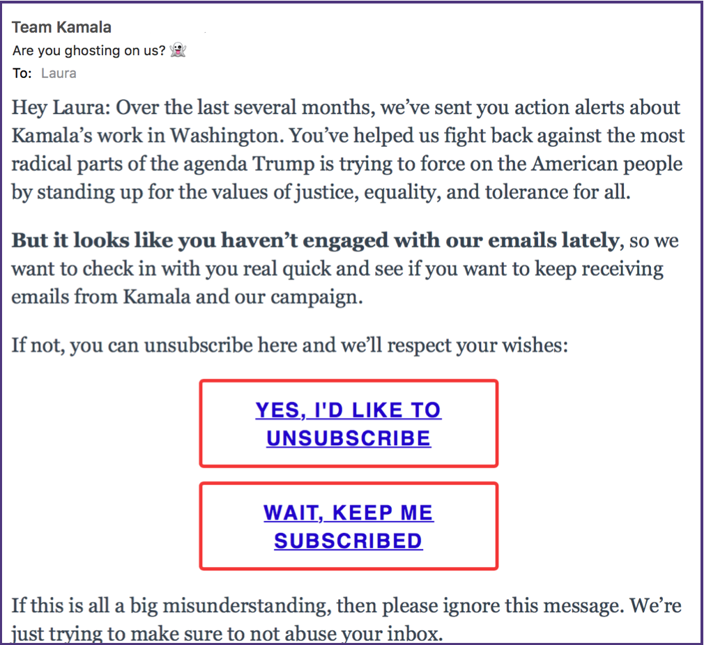
There are things I really like about this email and there are somethings I think they get a little wrong.

The good

This is a great subject line. I like the use of “ghosting” to describe what the email is about, and the inclusion of an emoji ghost. It all makes the subject line coherent and worthy of a click.
The other thing I really like about this is the large links, suitable for clicking on a mobile device. Really, people, some of us are old, have fat fingers or have phones with tiny text. Links, particularly for something like this, should be clickable on a phone.

The not so good

The not so good bit, though, is that I am reasonably engaged with my Senator’s emails. I mean, yeah, I don’t load images, but have clicked on some links in the past. Looking through my mailbox, the last time I clicked through on an email was June 9 or 10, just about 60 days before I got this message. That is more aggressive than I tend to recommend for most clients.

The weird

The weird bit is I’ve only received 2 messages since June 22, one of them being the re-engagement message. The other was an update related to my engagement activity on June 9. I know it’s August recess but the drastic downturn in volume coupled with a reengagement email makes me wonder if there isn’t something else going on.
Overall, this is a decent example of a reengagement email. It’s also a good example of a mobile email. I see designers fret about borders and alignment and never really see anyone discussing making links big enough to get your finger on. Really, I’ll take an ugly, unaligned email if it comes with a link big enough for me to click.


Related Posts

Smart email

This week I received an email from a vendor we purchased software from 6 months ago. And it was exactly 6 months to the day of our original purchase I received an email basically reminding me of what I purchased and asking me to update my contact information.

Read More

Content marketing

beddingpic There are a lot of mailing lists I’m on simply because I can’t be bothered to unsubscribe. Every week or every few days mail shows up in my inbox. I may look at the subject line, I may even open the message. But most of it is not interesting. It’s yet another sale at Sur La Table. It’s another promo from Macheist. Virgin America wants me to book a flight. All of these messages are useful and all, particularly if I’m trying to book a flight or looking to replace the dish I broke last week. But many of these companies send content that’s so close to the same, it’s not worth a whole lot of my attention.
I don’t think I’m that unusual in this respect. People are used to getting offers and so they know they can sit back and wait until they’re ready to shop and they’re ready to buy.
This is why content marketing can be such a win. It’s different, it’s new. It’s worth my time to dig into the email and read it. We recently bought some sheets from a company and they added me to their mailing list. Every week now, I get an email with lovely pictures of relaxing bedrooms and articles on how best to sleep and wash my sheets and replace my pillow cases.
From a consumer perspective, it makes me want to have a showroom bedroom with lots of comfy linens. From a marketing perspective I appreciate the hard work and dedication that goes into generating both the lovely pictures and the useful content. But I wonder if the effort put into the content generation provides a decent return on investment.
 

Read More

Mail that looks good on desktop and mobile

Over the weekend I noticed a new CSS framework aimed at email rather than web development, “Antwort“.
This isn’t the first or only framework for email content, but this one looks simple and robust, and it allows for content that doesn’t just adapt for different sized displays but looks good on all of them. The idea behind it is to divide your content into columns, magazine style, then display the columns side-by-side on desktop clients and top to bottom on mobile clients. That opens up much more interesting designs than the more common single fluid column approach.

It looks nice, it supports pretty much every interesting email client, but it also comes with some directions based on real world experience.

Read More